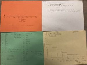
In this activity, we made four different graphs to represent the same data. Each person in the group made a different graph. We had a dot plot, a box plot, a stem plot, and a histogram. Each graph has its own strengths. The dot plot is useful for showing how the data is distributed. The stem plot is useful for showing how the data is shaped and the trends of the data. The histogram allows shape and distribution to be viewed easily. The box plot would best show outliers if there were any, though this data set does not have outliers. The box plot also demonstrates the full spread of the data concisely.
